Affi
Hector, Jake Karis and MiMi
Sound and considerate understanding of the technologies used in production of the video, for example in terms of set design quality and the use of FCP to create ‘earthquake’ effects.
There are evident links between creative decision making and use of technology on both productions of the video using professional digital cameras and in the post production editing process – in discussion of match of action, lip syncing and graphic matching – in glitch effects and blinder lights in production. This is sustained and thorough and accurate in discussion of the branded themes of the MV of urbanism and a social realist feel.
The commentary shows a discrete awareness of the use of new media technology and uses discriminating examples really well, particularly to selection and construction of narrative, using masks and editing techniques, such as cross cutting and the pacing used. Excellent command of terminology and well presented – understands and discusses convergence really well if implied in the commentary.
There is sustained justified decision making links between the technologies used the product and audience reception in terms of the Grime genre. Recognises the need to account for errors in the post production stage.
This is a well considered documentary, well done and Well presented work.
Hector McAlister- Advanced and Foundation Portfolio
Friday, 10 February 2012
Director Commentary/ Photoshop evaluation
This video above discusses how as a group we used new media technologies in the construction, research, planning and evaluation stages.
what we didn't discuss in the video was the use of Photoshop and the design of our CD digipak and music poster. I will be discussing this below in detail.
Firstly we used Mac technology software, final cut pro in order to edit the video, this consisted of selecting and arranging various clips we had shot. We used final cut pro in order to edit the shots to cut to the beat of the music track. http://www.apple.com/finalcutpro/top-features/
Photoshop enabled us to manipulate images and graphic design. By working with layers and using the tools within photoshop we could radically change the image to look like a completely new one. So with the ability to do this we turned our pictures into digipacks and posters.
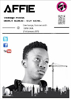
 We used photoshop as it allowed us to be as creative as we wanted and made us creative designers. We could use layers, enhance quality and definition, add effects and revise our photos. With the colour filters it enabled us to mess around and find the correct colour balance which best represent our artist. We wanted to make a digipack and poster which would stand out and be quite simplistic yet convey the star image we wanted to get across. We wanted to get across the image that he was from the inner city world. As you can clearly see with our promotional poster, we made the image black and white because it sets a tone to the poster and the artist. We added small bits of colour such as the record label logo and introducing new media technologies such as facebook, twitter etc.
http://en.wikipedia.org/wiki/Adobe_Photoshop
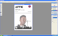
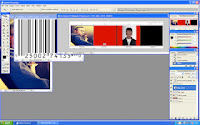
Here is a print screen of the editing process of our promotional poster. As I said before it allows us to edit images and use layers in order to create the poster and the digipack and right to the end to the final product. It was a long process which requires a lot of though which would lead to our desired target which was to attract the customers and the correct audience. We stuck to the black and white theme throughout the poster. The only things which we left in colour was the online media logos and the record labels logo, we did this because we wanted to let the audience see that they could find out more about him daily and assessable. I still think that the poster could do with further development as it doesn't feel creative or professional enough. Thats why we designed some of the elements as a group and then went on to finalizing it. I feel like there should be some more images to make the poster more exciting as well as eye catching.
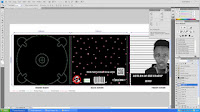
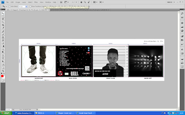
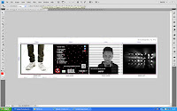 As well as our poster, I also used photoshop to create our digipack. This was slightly more challenging because there were four panels and not just one. Each panel had to be different in a sense that it either had to relate back to the video or it had to reveal some information about the artist and show some contextual meaning in it. The front panel is of Affie having a mug shot taken of him, this was a tricky task to do as it involved a numerous amount of tool within photoshop and many layers. Also effects were used to adjust the contrast and exposure of the picture in order for them to stand out to out target market. At this stage of the A level course I know that I have used photoshop in a more advanced and professional way than I did last year with the AS course I was using more tools, effects and layers in order to get to the final product of the poster and the digipack.
Tuesday, 7 February 2012
Evaluation task 4- pre production
Here below are the media technology’s I used which played a very important part of all process within my media production,particularly in pre production. In the industry such as film, television, photography and digital video pre-production refers to the tasks that must be completed or executed before filming or shooting begins. This include finding the actors or models, budgeting, scheduling, renting equipment, building the sets and tests.
 E-Blogger- tool and was an on going diary that helped with our decision
 Making. In order to display all this information and research we had done, we used E-Blogger. This online tool helped me publish all the create pieces of work that I had done. Within my blog are the discussions and my personal thoughts and interpretations of the new media technologies that I had used in order to make, plan and research ideas for the music video. Blogger can be made personal and you can upload work from external sources such as, slide share,word, prizes etc.
http://en.wikipedia.org/wiki/Wiki. Our final decision was the record company 'No hats no hoods'. The reason why we chose this was because of he reputation which was already there and the brand image. The UK's biggest grime label was No hats no hoods.http://www.nohatsnohoods.bigcartel.com/
A difficulty that we faced was finding the music track in a (WAV) format. We need this music file not only for the post production stages but also for the shoot day, so we could shoot in time with the song. Having looked all over the internet and looked for the hard copy in music shops such as HMV, it was no where to be found. So we e-mailed Mikill Pane himself asking if we could have a WAV file, but there was no reply. So in the end we used a high quality Mp3 file which worked well and had a good enough sound.
Tuesday, 31 January 2012
Saturday, 28 January 2012
TASK 3- what i have learnt.
Over the past week i have learnt a lot from audience feedback. Our group worked hard on making sure that our three products linked well. We wanted to give our artist a powerful and kingly image and i feel that we achieved that. Doing the questionnaire gave us a broad spectrum of feedback, we chose to have an equal amount of female & males and also a variety of people from different countries. We chose to do this because it gave us lots of different opinions and ultimately that is what we wanted. The questions were simple but allowed the student doing the questionnaire to express their opinions and give us there honest response to the question. It also gave us a clear understanding of the weaknesses and strengths amongst our three products so we learnt where we could of improved on the production and where we could of changed it.
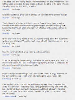
The feedback on the video was mostly positive, we wanted people to understand and feel his power and looking at the questionnaire it is clear that they felt he was portrayed this way. Many of the comments from the students mentioned how they felt Affie (our artist) was strong, confident, powerful and kingly. The effects and lighting were also commented on often. The students seemed to really like the earthquake effect that we added on during the editing process. They also said they thought the lighting throughout the video was extremely strong and also helped to portray the kingly persona. We posted our video on youtube which gave us a lot of positive and constructive feedback. The reason we choose youtube, is because it is a free video sharing site which interlinks with social networking sites and society. Below is a screen shot of the comments and feedback we ot from posting it on youtube.We also received а lot on facebeook on the editing and use of shots, as well as our powerful lighting having used blinders
 The constructive criticism on our digipak and poster was extremely helpful. We had lots of positive feedback on the two products as well but a few students said what we could improve them. Most of the comments were about the poster. Some of the students noted that they feel the poster should have more detail, more colour and stronger bolder text. They also said that it would be good if it linked with the digipak, maybe including more to do with the video. The digipak itself was quite successful amongst the students. They really liked the fact that it completely linked with the video and was simplistic. They mostly all thought that the genre was clearly displayed through the images used on the digipak. For example the shot of our artists shoes, this shows he has been around, walked a lot of streets, those shoes have experienced a lot.
Overall i have found getting audience feedback massively helpful, it was also a great learning process. It taught me to accept and take on board criticism and apply it to my products so the final outcome is very successful. In our video the main thing I would change with the feedback we have gathered is
that we wanted to create an enigma however i think that it wasnt clear enough. So the thing i would change is that i would make the relationship between Affie and the girl and make the narrative more clear to the audience.
The feedback on the video was mostly positive, we wanted people to understand and feel his power and looking at the questionnaire it is clear that they felt he was portrayed this way. Many of the comments from the students mentioned how they felt Affie (our artist) was strong, confident, powerful and kingly. The effects and lighting were also commented on often. The students seemed to really like the earthquake effect that we added on during the editing process. They also said they thought the lighting throughout the video was extremely strong and also helped to portray the kingly persona. We posted our video on youtube which gave us a lot of positive and constructive feedback. The reason we choose youtube, is because it is a free video sharing site which interlinks with social networking sites and society. Below is a screen shot of the comments and feedback we ot from posting it on youtube.We also received а lot on facebeook on the editing and use of shots, as well as our powerful lighting having used blinders
 The constructive criticism on our digipak and poster was extremely helpful. We had lots of positive feedback on the two products as well but a few students said what we could improve them. Most of the comments were about the poster. Some of the students noted that they feel the poster should have more detail, more colour and stronger bolder text. They also said that it would be good if it linked with the digipak, maybe including more to do with the video. The digipak itself was quite successful amongst the students. They really liked the fact that it completely linked with the video and was simplistic. They mostly all thought that the genre was clearly displayed through the images used on the digipak. For example the shot of our artists shoes, this shows he has been around, walked a lot of streets, those shoes have experienced a lot.
I feel that the feedback was very beneficial to our group, it allowed us to think about what we can improve to make our products better and we found out if it was a good or bad production from the way the audience reacted. We also found that our audience wasnt the usual audience but it was a working class urban street audience. It also made us think more about what our chosen audience wants. As well as taking the constructive criticism on board we also really enjoyed all the positive comments. It showed us that our chosen audience recognised and acknowledged our products and ultimately thoroughly enjoyed them.
Overall i have found getting audience feedback massively helpful, it was also a great learning process. It taught me to accept and take on board criticism and apply it to my products so the final outcome is very successful. In our video the main thing I would change with the feedback we have gathered is
that we wanted to create an enigma however i think that it wasnt clear enough. So the thing i would change is that i would make the relationship between Affie and the girl and make the narrative more clear to the audience.
Friday, 27 January 2012
Feedback -evaluation Task Three
Can you please complete the posting of evaluation task three over the weekend? Thank you.
Monday, 23 January 2012
Feedback
An excellent presentation for evaluation task two. I feel that you show excellent knowledge and understanding of your MV and the ancillary tasks and how these work well as a promotional campaign. I like the way in each you link your actual product to real media examples and I think that you have encompassed a real sense of target audience into your campaign.
What could be developed - consider Kotler's point on the marketing mix - the 4p's
Also think about how you have used your star image (apply Dyer) and if this is sustainable across the campaign.
Do you feel that the image is consistent across the campaign and what image is promoted to your intended audience?
Preparing Task 3- What have yoy learnt from your audience?
Our final product is on youtube which means that the video is opened to a global market which also means we are able to gather constructive feedback on our video. This is a picture of all the comments and feedback which is on youtube.
Focus group-
A focus group is a form of qualitative research which is used to get feed back from people who have watched our video.
Here is an example of a focus group being filmed!
Friday, 20 January 2012
Friday, 13 January 2012
Teacher Feedback
A creative and imaginative way to present the conventions of the music video. However I feel that further evaluation is needed to assess how you have used those conventions. You can do this by further post entries which:
1. Make more explicit the conventions of music video's and digipaks
2. Use of a wider range of examples - linked to real media
3. Fuller evaluation - what have you used and developed/ challenged.
Can you please extend evaluation task 1 to add more detail to your response.
Thursday, 1 December 2011
Evaluation of digipak.
I think that our Digipak cover gives the image we wanted for Affie. The front cover that is in black and white gives off the effect that he is quite retro and old school. This immediately attracts the right audience for Affie because the image then relates back to his music, which is old school grime. Also the title of the album is ‘Return of the Flattop’ also give the effect of that it is form the late 80’s and 90’s. The hair style we used in the picture also reinforces this .So the overall image of the front cover is that Affie has taken the old genre of rap and hip hop and bringing it into the 21 century with the relatively new genre, ‘Grime’. The idea of our video was that Affie is meant to be something ‘out of this world’ which is represents by the translucent effect we have applied on Affie. It shows that he is kind of like a super hero.
This whole idea is applied throughout the whole digipak, like on the back cover there is a picture of the star cloth we used to represent that fact that he is something not from this world and is from another. He is supposedly super human, hence his unbeatable choices, beats and flows in his tracks. Moving on to the back cover we have put a few thing which will help our audiences access his music more easily and find out more about him. We have put a blackberry messenger bar code so people can scan it, which will take them to his website. Also we have use the links so people can find Affie and his music with the online media. We have done this so we are keeping up with the new technologies and making it quick and easy for our target audience to access more information about him and his music.
The other pictures we have on the other slides of the digipak were put there because we want to tease the audience to make them want to watch the video. They are simple but effective.
Wednesday, 30 November 2011
Tuesday, 29 November 2011
Process of editing promotional poster and digipak,
Thursday, 24 November 2011
The editing process- two
At the moment in the editing process, we have finished the rough cut which we now need to polish up. However on the side of doing this I have created a new sequence window so there is a fresh edit window. The point of this is that now I am going to do a completely new cut of the video. By doing this we can compare the shots between the two videos and use some from one and vice versa. Also we will be able to see which one is more effective and the most interesting thought. So the new sequence that we have worked on has faster cuts which we worked on to make the video more interesting and for the most obvious reason, to fit with the pase of the song. On top of doing this i create this glitch effect which makes you slightly confused which has a good effect and impact of the video. Once the video is then turned into HD we can then ad some more effects, like shaky effects and blury effects to really make the video wild.
Saturday, 19 November 2011
Feedback
Good blogging. I feel that you have really captured the spirit of your shoot day. Also in the critical reflection you need to consider the star image you were trying to construct with the set design and technical equipment, for example you mention lighting in the blog, but be more specific - you used a high key and fill lighting with a Starcloth to focus on the stylization of the artist, compared to the directional blinder lighting of the latter shots, connoting a more sinister side to the artist - just food for thought.
Friday, 18 November 2011
The editing process.
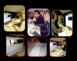 Having had a successful shoot day, the next step is to upload our footage onto final cut pro (http://en.wikipedia.org/wiki/Final_Cut_Pro) and start editing. I thought that this was my main strength, so i did a lot of the editing to increase efficiency and because i had the most experience of his. However our group decided on this so we split up and do separate tasks like the digipak and the poster etc. When we started editing, we had to go through the process of choosing the best shots out of all of them, then placing them into the log bin. This took a fair bit of time but when it came down to editing we manage to speed this process up. http://en.wikipedia.org/wiki/Editing
Account of the shoot day!
On Friday 4th November we shot our music video shoot for our media coursework, which overall I think went better than I expected. We prepared most of our set the day before so at the beginning of the shoot day we didn’t waste time setting up. In the morning before we started, we had a few issues, due to the weather. The majority of our pop video was to be filmed inside the studio, which was no problem. Although the other half of our shot day was in Guildford and the weather was forecasted rain and thunderstorms .We decided that we would make a decision after lunch, whether we would go ahead with filming in Guildford or whether we would have to think of another idea. Our day didn’t go exactly according to plan, but because we had set backs and had to come up with more shot ideas that we could use as back ups if the weather wouldn’t allow us to film it was a good learning tool for the future because I now know that if our shooting schedule doesn’t go to plan then our group will have to come together, make decisions and compromise.
Preparation
We had to set up the star cloth and staple the red carpet to the steps so it didn’t look shabby and un-realistic. We also picked out his costume the day before the shoot so that we were all prepared so we could go straight into rehearsing the first scene. We dressed Affie in the clothes we thought would be appropriate for our target audience which we all agreed was up to date with the fashion. So we made Affie look trendy as well as individual. We made sure that Affie’s outfit didn’t clash with our set with the red carpet. We started the shoot day with a few rehearsals and told Affie what we wanted him to do and let him get into character. We started with Affie on the throne and the red carpet because it was the most complicated set and also wanted to make full use of it and get as many shots of him using the space as possible. In the first couple of hours of filming Affi wasn’t as comfortable as we would of liked him to be. He found the lyrics hard to get to grips with and also interacting with the camera proved difficult. It took a lot of short run throughs to get Affi more confident with what he was singing and as a result of that it did set us back a little time wise. Overall as the shoot went on Affi became less and less reluctant to perform to the camera and soon started to really enjoy it and get into the character he was playing. These shots looked better as he knew the words and was interacting with the camera.
Lighting
The lighting we used for this set was very cool. We could move them around, switch them on and off and change the colour of them by using the lighting control desk. We wanted to put spot lights onto the pillars to make them stand out and also create a more royal and kingly looking set. This also highlighted the flat caps that were stacked up upon the pillars to really be eye catching to the viewer. The reason we choose to do this is because having flat caps on grand pillars in a very rich looking set really juxtaposed the kingly image to the audience. Without the lighting the set would not have looked as impressive. They made the set look very regal and striking.
Although we changed the shooting schedule a bit we decided to shoot in three different sets these included two in the studio and one in Guildford. In the first set we had a variety of shots which we alternated between. These included :
Extreme close ups
Tracking shots
Establishing shot
Extreme close ups of different parts of his face
Shutter Shots
Side shots of the side of his face
Shaking effect shots
Because of the situation about Guildford we used all of these shots and we decided on shooting some more creative and effective shots to use as back ups if Guildford was called off due to weather.
The changing of the sets was actually really exciting and interesting because it meant we didn’t have to just film one set for the whole day instead we got to work with different sets with ultimately encouraged us to come up with even more imaginative shots. Not being able to predict the weather our group decided to take the risk and go and shoot in the town instead. Shooting in Guildford was a much different experience as to shooting in the studio. The reason I feel this is because is that we had to stop and start due to the public walking past or accidentally interrupting and also the weather was another disadvantage because we were loosing light quickly and obviously we didn’t have lights to control therefore we had to make full use of the natural light.
Most importantly our group worked really well together. The day of the shoot we had not disagreements and all took to roles we felt most confident and comfortable with. We definitely had a good division of labour and every group member played an equal part throughout the day. I took on the role of being on camera mostly, which I enjoyed very much. I had to call out when the camera was rolling in order to make the other group members aware of what I was doing. I had to start recording and cut when told to by the directors and people on playback. The tracking shot was especially tricky at times because I had to keep the camera very steady as I was being pushed back and fourth along the tracking tubing. I also had to make sure that the camera was constantly on the subject of our shoot eg ‘Affi’. The other group members took on roles such as – Mimi Jefferies – Director, Jake Cecil – Lighting controls and Karis Arghiros – Sound & playback. Overall I feel that our shoot day went very successfully. There were a few minor set backs but our group overcame them and shoot a lot of professional looking film which is proving very useful in the editing process. I had great fun filming and being part of what I feel is going to be a really attractive and creative music video.
Screen test of Affie.
This is our screen test of Affie. This was to see if he looked good on camera and fitted well for the song.
Friday, 21 October 2011
Feedback
An excellent presentation well dome. Good use of Scribd. Informative from research to plannng and the final concept. An area for development would be to state what you would develop further and how would the product appeal to the target audience
Tuesday, 18 October 2011
shoot day plan
Shooting Schedule
In order to be extra prepared, we decided to create a schedule of our shoot day. Having two locations is another reason to plan our time, as travel time also comes into our shoot day and wastes time out of the short time we have already.
9 30 – Check all props are in place, and the set is perfect. Rehearse Georgina and Affie, with background song playing- like the screen tests.
10 -00 – 11.30- Shoot Affie's shots in film studio
List of shots
10.00- 11.30
– Shoe
– Mid close up of the face.
– Puddle and Affies foot
– Lips
– Blackout
– Establishing shot of the chair and Affie
– Close up of Affie
– Lips
– Close up
11.30- 1.00
Shots outside at Beatrice Webb, abandoned playground- barrel being lit Barrel- oil can outside
– Over the shoulder view of the girl and the barrel
– Girl hands over the barrel
– Establishing shot of the barrel
– Extreme close up of the fire coming out of the barrel
1.00-1.20 -Lunch
1 .30-2.00- Travel to Guildford
2.00-2.30- Find the location of chosen shooting area, and set up. Off licence Shop
2 30 - 4.30
List of shots
- Girl going into the shop
- Outside shot of the girl buying a drink inside.
- She walks out the shop
- Girl continuously walking down a street
- filming her from behind
-filming her from in front
- Side on angle shot of girl walking
- Feet shot of the girl walking
4 30 - 4 50 - travel back to school
Friday, 14 October 2011
Feedback
The animatic is proficient- there is no casting on your blog and somewhat an over reliance on group presentations. It is difficult to identify and credit your own ideas on his basis due to a lack of individual evaluation - perhaps you need to see me about this, to help identify your work - I know you have completed quite a bit! There are gaps in your most recent blogs these are blank with no information on - pleasecomplete these posts as soon as possible.
Wednesday, 12 October 2011
Proof of editing
This is a short video of our group putting together some of our clips for our animatic. After sketching all of the shots and placing them in order we were then provided with a camera from the media department to film each sketch of our shots seperately for 10 seconds. After doing so we then took the film footage up into the editing suite and cut it to fit with the music for our video aswell as our music video idea.
Party animal anematic.
After drawing out all of the shots for our storyboard in detail, we were then given a camera by the media department to film our story board. The process of doing this was that we had to film each shot for ten seconds and then edit it in final cut pro to create and animatic. The whole group was involved in the editing process but editing is one of my strong points as I have studied it before. Now I have edited the animatics I feel more prepared for when it come to editing our final video. The editing process proved tricky at time because we had to be completely sure that our shots fitted completely with the music.
Tuesday, 11 October 2011
Target audience for Affie
The target audience for Affie will be peole who are into the grime music genre and people who are fans of the mainstream artist Dizzie Rascle. This is because Dizzie used to be a grime artist when he first started off. Also the audience would have their own style and they will be alternative in their dress sense, like the artist him self. Here are a few examples of what fans would look like.
Saturday, 1 October 2011
Feedback
Your response is sound and you have been creative with your blogs, I particularly like the use of headings with good layout and design. You have a secure knowledge and understanding of who you want your artist to be signed to; perhaps you could link this further by stressing the advantages that your artist has signed to the particular record label?
You need to post your target audience and profile them well, this could be developed with the use of VALS. Research needed into CD covers and have a wide range of examples, and this would be developed further if you can link the real product to how it will influence your own designs.
Tuesday, 27 September 2011
Influences of the Digipak covers.
The front cover of an CD for a grime artist would usually be trying to give of an image that they are hard and tough. Today in the mainstream market on the album covers it is usually a picture of the artist face or of the artist posing which gives it this mainstream look. However in the niche market of grime they don't show their faces because the people are more interested in the music they produce instead of what they look like. Therefore to try and get Affie to break through to the mainstream market we should put him on the cover of the CD. Here are a few images to give us an idea of what we want on our cover.
Monday, 26 September 2011
Research and evaluate the institutional context of your artist?
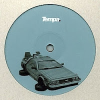 When doing the research for our artist Affie i related him to an artist who i think is similar to what the image of Affie is like in my head. With the song we have chosen (Party Animal- Mikill Pane) the artists that came into mind was Dizzee Rascal. This is because he was a grime artist in his early days and then with his grime music he brought it to the mainstream market and was successful. Dizzee is with a mainstream record label called XL Recordings. He has also set up his own record label called Dirtee Stank, which is purley grime music. Another record label that Affie could be signed to is Conglomerate Records. This is more of a Hip Hop genre record label which could be good for Affie, because hip hop is very popular in the mainstream market at the moment. However Affie is still a low profile artist so putting him in such a mainstream record label will not do him much favor. Therefore we should put him in a record label which is in between the two. There is a label called Tempa which i think would be perfect for Affie because there are similar artists within it. http://www.tempa.co.uk/
I think this would be good for Affie because artists with similar music types such as Skream and Benga etc are with the record label.
The target audience of our artist 'Affi' would be the younger generation. A teenage audience to young adults. Between the ages of 16-20. The fans of Affie would probably be from a working class background because grime was brought up in underground clubs which were cheap to get into. Also the fans would be huge grime artist fans.
Sunday, 25 September 2011
Presentation on examples of shot ideas and design elements.
Sunday, 18 September 2011
Feedback
This a is a really proficient start to blogging of your concept with good research into the grime Genre.It would be even better if more use would be made of academic ideas, such as Negus or Dyer into the music industry and stars. This would help underpin and support the points you make. A creative blog - where you have posted the brief, some of the text cannot be read.
Friday, 16 September 2011
Initial ideas/treatment
Song- Mikill Pane – Party animal remix, featuring empressa.
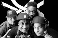
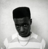 The Genre of the song and act we are doing is - Grime/ dance music. The reason we have decided to investigate The Grime/ Dance genre is because it’s a genre that is of huge interest to our age group. It is also a new genre. Research – History of Grime/ Dance.
The grime/ dance genre was first discovered in
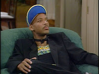 Our type of act will have a particular style. we would like this style to be Individual, quirky.
These are a few images of the type of look we are going for. We want our act to look more old school and retro.
 These four images relate to the style and type of act we would like to convey, images are vital, especially as they have to fit our genre and overall style.
Subscribe to:
Comments (Atom)


