This video above discusses how as a group we used new media technologies in the construction, research, planning and evaluation stages.
what we didn't discuss in the video was the use of Photoshop and the design of our CD digipak and music poster. I will be discussing this below in detail.
Firstly we used Mac technology software, final cut pro in order to edit the video, this consisted of selecting and arranging various clips we had shot. We used final cut pro in order to edit the shots to cut to the beat of the music track. http://www.apple.com/finalcutpro/top-features/
Photoshop enabled us to manipulate images and graphic design. By working with layers and using the tools within photoshop we could radically change the image to look like a completely new one. So with the ability to do this we turned our pictures into digipacks and posters.
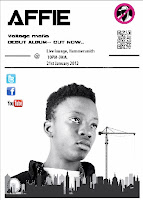
 We used photoshop as it allowed us to be as creative as we wanted and made us creative designers. We could use layers, enhance quality and definition, add effects and revise our photos. With the colour filters it enabled us to mess around and find the correct colour balance which best represent our artist. We wanted to make a digipack and poster which would stand out and be quite simplistic yet convey the star image we wanted to get across. We wanted to get across the image that he was from the inner city world. As you can clearly see with our promotional poster, we made the image black and white because it sets a tone to the poster and the artist. We added small bits of colour such as the record label logo and introducing new media technologies such as facebook, twitter etc.
http://en.wikipedia.org/wiki/Adobe_Photoshop
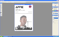
Here is a print screen of the editing process of our promotional poster. As I said before it allows us to edit images and use layers in order to create the poster and the digipack and right to the end to the final product. It was a long process which requires a lot of though which would lead to our desired target which was to attract the customers and the correct audience. We stuck to the black and white theme throughout the poster. The only things which we left in colour was the online media logos and the record labels logo, we did this because we wanted to let the audience see that they could find out more about him daily and assessable. I still think that the poster could do with further development as it doesn't feel creative or professional enough. Thats why we designed some of the elements as a group and then went on to finalizing it. I feel like there should be some more images to make the poster more exciting as well as eye catching.
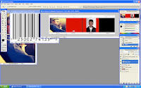
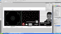
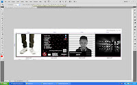 As well as our poster, I also used photoshop to create our digipack. This was slightly more challenging because there were four panels and not just one. Each panel had to be different in a sense that it either had to relate back to the video or it had to reveal some information about the artist and show some contextual meaning in it. The front panel is of Affie having a mug shot taken of him, this was a tricky task to do as it involved a numerous amount of tool within photoshop and many layers. Also effects were used to adjust the contrast and exposure of the picture in order for them to stand out to out target market. At this stage of the A level course I know that I have used photoshop in a more advanced and professional way than I did last year with the AS course I was using more tools, effects and layers in order to get to the final product of the poster and the digipack.
No comments:
Post a Comment